-
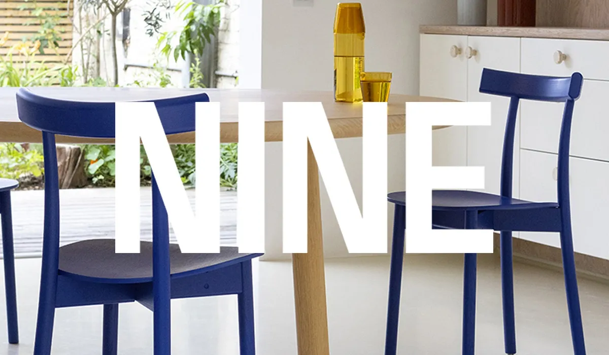
New brand NINE unites emergent and established European talent, creating confident and refined design for contemporary spaces.
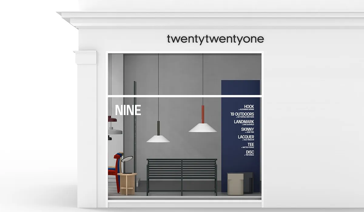
We are honoured to partner with them and be the first globally to launch the collection in-store, as NINE will take over our Upper Street window during the London Design Festival. The brand was formed by Nine United (a company that owns several well-respected design furniture and lighting companies, including &Tradition, Verpan and Frandsen).
Nine United’s European team, led by Katherine Hoeger, invited collaborators from the design industry’s creative and commercial communities around their offices in London, Berlin, Paris, Amsterdam, and more to participate in the creation of a new design brand that could meet the demands of today and establish a platform for talent and collaboration.
This led to a collection of furniture, lighting, and homeware displaying a fresh directness combined with a strong sense of economy and utility. NINE produces products designed to be used and enjoyed for many years and strives to practice efficient and responsible processes, utilising recycled and recyclable materials whenever feasible.
From NINE’s roster of designers, three are London-based - Tom Butterfield, Alexandra Gerber and John Tree. We caught up with them in conversation with Sam Stotesworthy, who is responsible for product development at NINE, as they interviewed each other about their design process, development and experiences working with a completely new brand as it emerged through the pandemic.
 Skinny Chair by John Tree © Nicola Tree
 -
IN CONVERSATION
Tom Butterfield | Designer at The Butterfield Brothers
Alexandra Gerber | Designer
John Tree | Designer
Sam Stotesworthy | Product development at Nine
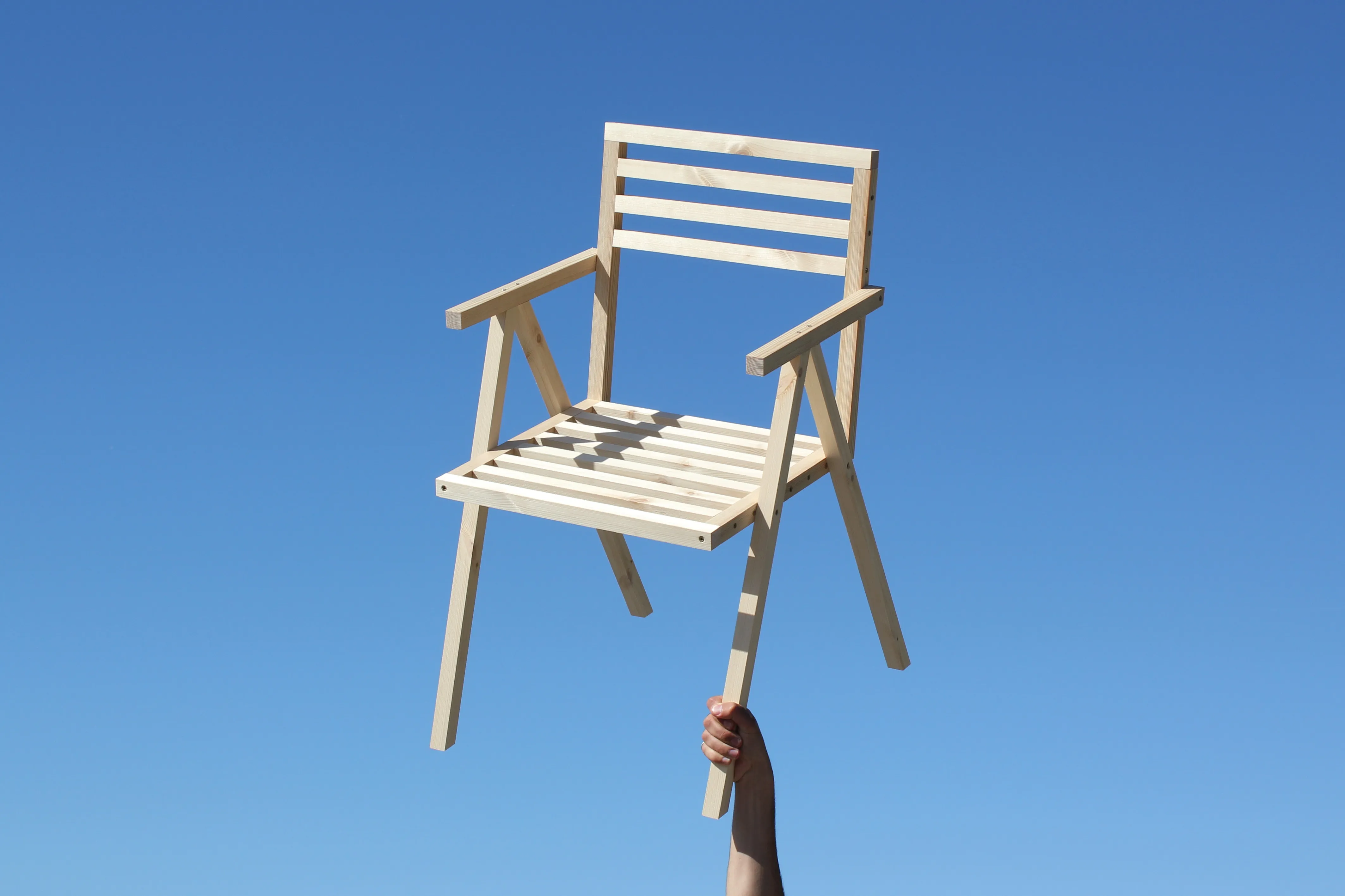
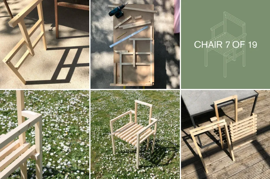
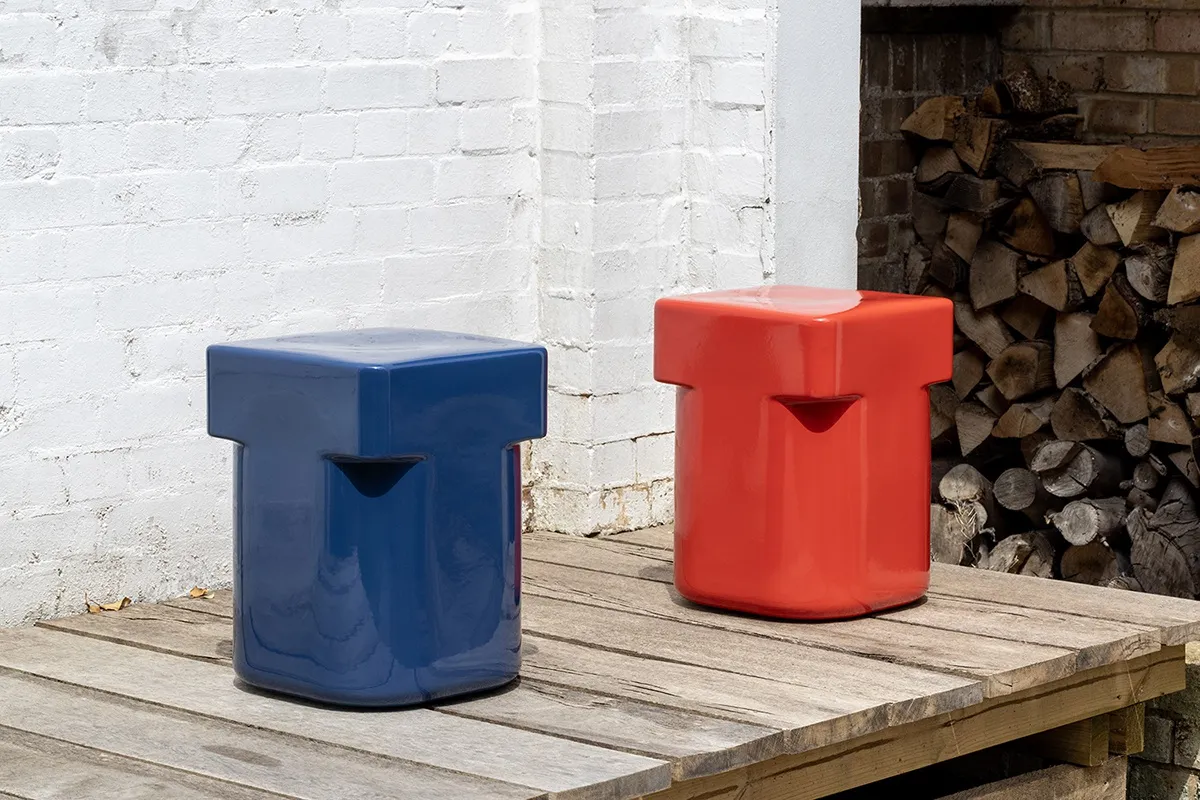
19 OUTDOORS | Tom Butterfield

19 Outdoors by Butterfield Brothers © George Kroustallis
John Tree Okay, Tom. 19 chairs began as a lockdown project. Creating 19 different chair designs in 19 days which is no mean feat. Did it become more difficult as the project went on to create a new version of the humble chair?Tom Butterfield I would say probably not, actually. We found it got easier as it went on because through the process of making one of the chairs it seemed to spark other design ideas. The 27 millimetre square section timber was the only parameter that we gave ourselves, so we always had a starting point. I guess the only thing to be aware of was them looking too similar to each other. We ended up designing quite a few and then had to rein them back to 19 from about 60 designs.JT Was the first one very different to the last one?TB The first one was very simple, probably as simple as you can get. And then, towards the end, it got more complicated. The final chair was actually a bench for us both to sit on, which was a combination of the previous 18 chairs all in one.JT You worked with 27-millimeter square section timber and 40-millimeter screws. Did you set any other criteria?
TB The only tools we used were a chop saw and drill. We then made a jig at home where we could position the individual slats together, but we didn't have a workshop. It was all just done in our dad's garage.

19 Chairs project © Butterfield Brothers
JT But there is a sort of character where you butt joints rather than lap joints, a lot of wooden chairs do this lapping thing, but you've got this kind of butting thing.
TB If you look into the construction of each chair, they were not made in a very structural way. If you were to make them properly, you wouldn't build them the way I built them - It was purely an aesthetic process.
JT It was sketching with wood?
TB Yes, rather than actual functioning or even comfortable chairs, it was more a study in seeing what different forms you could create using the one material.
Alexandra Gerber But you couldn't sit on them? Or you could?
TB You could sit on them. But if you kind of (motion wobbling the chair, laughing) they’d start to loosen up a bit and then just fall apart. It was very cheap pine, the cheapest wood I could get, it wasn't even held together with glue - it was purely just screwed together.
AG Did you ever consider making them in wood with NINE or was it never a thing?
TB No, I think I quite liked the crispness of aluminium and how sharp it was, so never really considered wood. We wanted the collection to remain looking as clean and graphic as possible.
Sam Stotesworthy From our perspective at NINE, we had a brief for an outdoor furniture collection. So that's when we got in touch with Tom because we saw a particular image in the 19 chairs Instagram feed that looked like a really great outdoor chair. It was against the blue sky and you could instantly see it. So we approached Tom and said, why not make this as a metal outdoor collection? It's exactly the same principle with the square section, it's just aluminium, it was very easy to maintain the character.
19 Outdoors Stacking Armchair prototype © Butterfield Brothers
TB NINE helped Will and I pick out the particular chairs. Katie immediately went to - I think it was chair 11 that she thought looked like a great stacking chair. I never really thought about it like that. So it was kind of her who pulled out the individual designs and said, do you think you can work these a little bit more and see if you can make them into an outdoor collection. That's where it's stemmed from.
JT When you started the project, did you expect to gain traction the way that it did? And ever consider it may translate into a range of furniture developed for production.
TB No, not at all. The project started purely for wanting to stay creative during lockdown. Making furniture was triggered by another project I had been working on, and I really liked the rawness of being able to screw something together that you could then sit on and see how it felt. Also, working with my brother was never the plan either; it was just something that happened. Will questioned what I was going to do with all these chairs, and that's where the 19 Chairs project was born. The traction and popularity of the project was purely down to the power of social media. So it was never really the plan, but to have now designed our first commercial project, which is a large outdoor collection and to have our own studio feels a little surreal, but we’re both very grateful.
Instagram | Butterfield Brothers
JT It's a very unusual route and not a-typical at all is it?
TB No, exactly.
JT The intention was just to have fun, almost a graphic design project, like sketching.
TB Yes, for me, it was like a project for my portfolio. I set myself a brief and ordered loads of material, I think roughly 500 meters, and the challenge was to see how many different forms I could create. I didn't actually intend them to be functional in any way. I liked the idea of a chair with just three or six legs.
JT Why not do that in CAD? Why did you do it in real 3D in real life?
TB I’m someone who really enjoys being in the workshop, and much prefer getting hands-on and building rather than being in CAD. To be able to build it and photograph it at the end - it was very rewarding.
SS I remember when you came up to our office and we had the first sample of the stacking chair. John came in and he just pulled the chair and said, oh, the angle needs to go back a bit, and just put a 30mm book underneath the front legs, tip it back a bit...'
TB And it worked.
SS We sat in it and knew that was it, and it ended up being the angle we used. It's quite nice how there's a London community already, John and Tom being in the room at the same time, the super experienced designer can just lend a little bit of a hand to the young, up-and-coming one.
JT It's nice, that kind of informal sharing. -
-
SKINNY CHAIR | John Tree
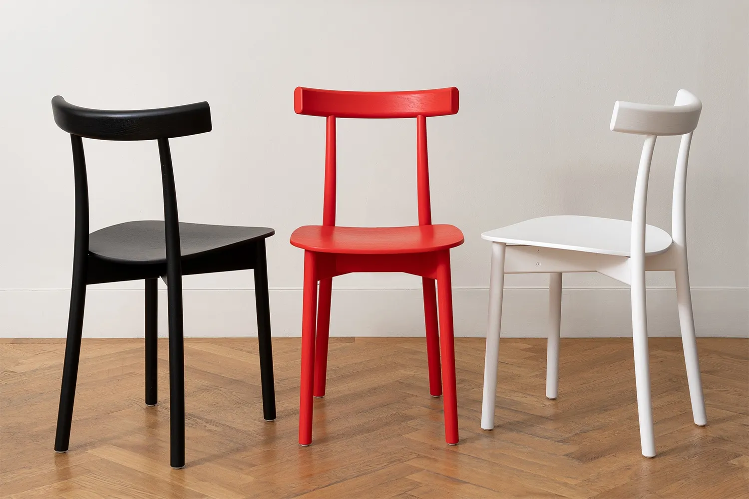 Skinny Chair by John Tree © George KroustallisAG The skinny chair is both sculptural and graphic in form. How do you translate a design like this from drawing to three dimensions?JT Well I guess it's about going between the digital world and the physical world with making sketches and doing CAD files. And then we did a whole series of small one-to-six scale 3D prints. During that development process, I would send 3D prints to NINE and it evolved that way really. It was a lot skinnier at first. A lot of the early designs were very thin and you’d print it out and think whoa, it looks too thin. So it's a backwards and forwards process going from the physical world to the digital world and making sure those things connect.
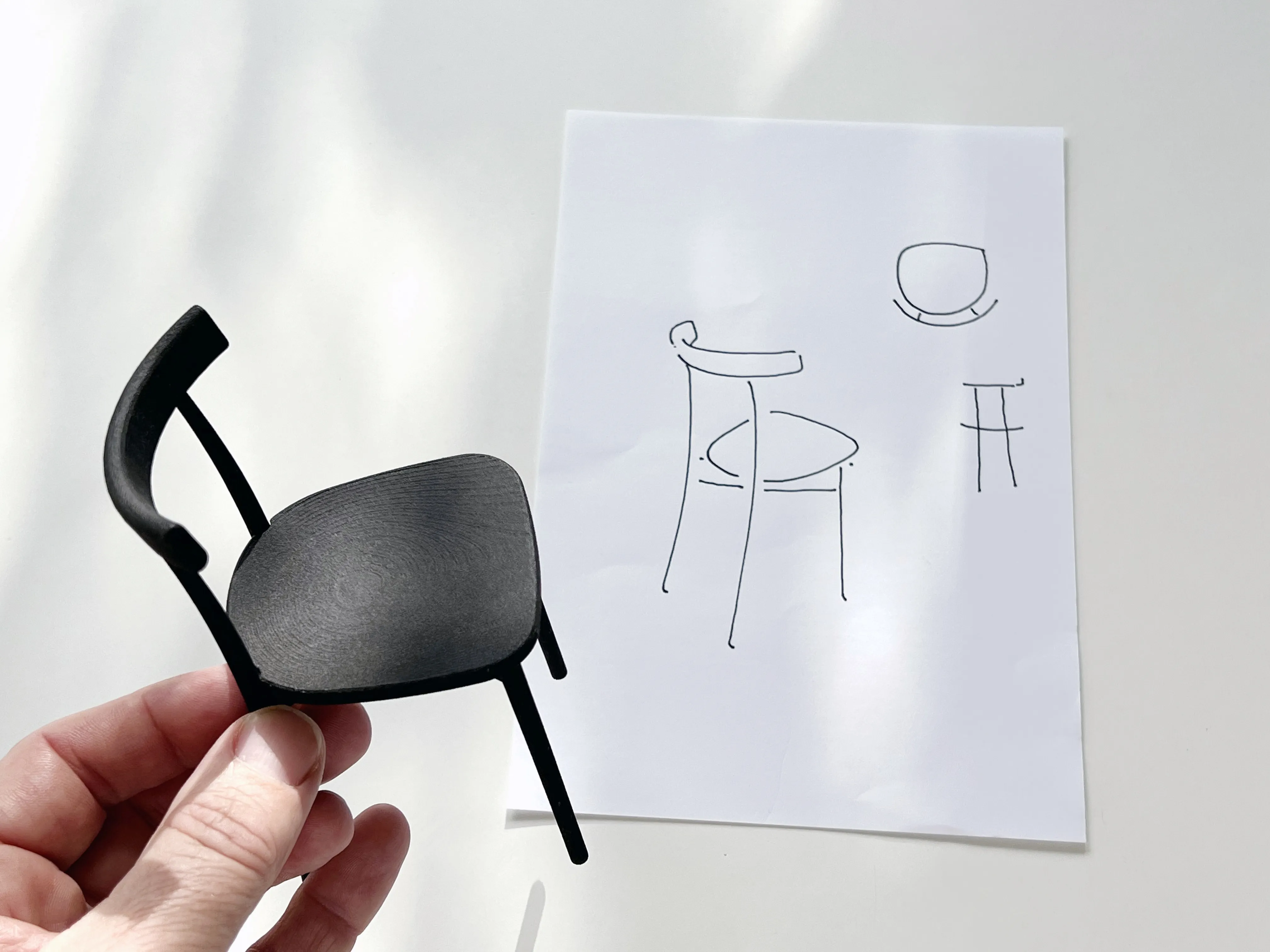 Skinny Chair one-to-six model and sketch, © John TreeAG Do you always work exclusively in CAD or do you make a mock-up of it one-to-one?JT I didn't make a mock up one-to-one. I've designed a few chairs, I have quite a good sense of what proportions are needed. I have all the chairs that I've done in CAD and previous chairs in my office. So I can sort of sense, this one's a bit too gentle or the front is nice on this and this type of back would maybe work for this type of chair. In the head, there's that connection between physical and digital as well. So you could overlay -AG You don’t need to do it anymore. It's all there!JT Sort of. This chair did hit it pretty quickly on the first few revisions. It was kind of lucky, the proportions ended up being very well balanced, I think. There were iterations at one-to-six, but the first samples were really good. I think maybe it was a little bit high? But basically good.
SS We hardly changed it at all, it was quite uncanny how it just hit the nail on the head straight away. And I'm actually using the chair in the office now, I sit on it for eight or nine hours a day and it is quite amazing how comfortable it is.
JT I've designed a few task chairs previously and had the idea of wanting the chair to be comfortable for long periods of time, that experience came into this chair and educated the design.
AG Does the name reference its general proportions or refer to its paired-back slender form?
JT It's quite compact, the idea was to create a chair with a very small footprint, but still comfortable. You can fit a lot of them around a table and if a guest joins, you can squeeze more in. It's kind of casual and relaxed, but narrow - quite a lot of chairs these days are large and bulky, they feel statement-y. It's about being narrow in profile, particularly from the back it has very slender proportions so it’s visually quite light. It's both - the size of it and the visual character. There's a particular detail on most chairs, the back leg is visibly connected to the backrest. I wanted to hide that and put the leg inside the backrest, the top of leg needed to be really slim to do that trick and the bottom had to be reduced a bit to balance that and that's where the 'skinniness' came from - trying to resolve that junction.
AG The lightweight design perfectly captures the essence of the archetypal chair. What were the criteria and main ambitions of the new design?
JT It was trying to be a kind of universal chair - everyone has an image of a chair in their head. If you ask them to sketch it, it's very basic - four legs, a back and seat. So it's trying to be very economical and essential in its character, slightly referencing German and Viennese cafe chairs - black and a little bit Thonet with bentwood as a sort of typology that's slightly domestic, but not out of place at a cafe.
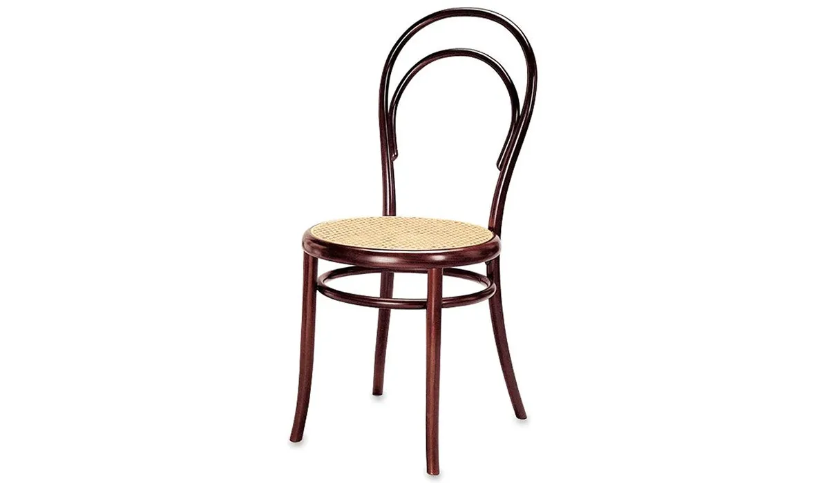
N.14 Chair by Michael Thonet © Wiener GTV Design
It was exploring that typology, but then trying to find a new freshness where it's super clean and super light, taking away as much structure as possible. So hopefully it feels familiar, it's not demanding attention from you visually or trying to be a hero in a room. It's hard to get that balance, it's really interesting just trying to get on that knife edge of being familiar and fresh.
-
-
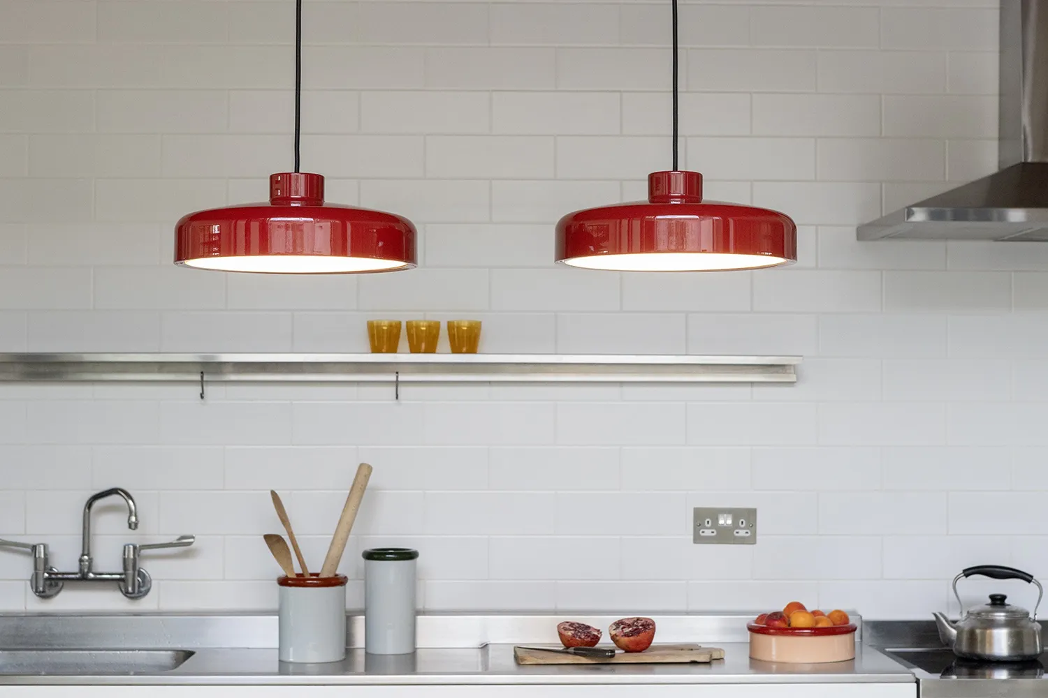
HOOK | Alexandra Gerber

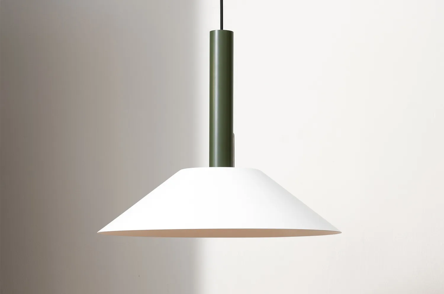
Hook pendant by Alexandra Gerber © NINE
TB Your design approach often focuses on deconstruction and the re-contextualizing of components. How was this applied to the creation of the hook pendant light?
AG I was asked to make a collapsible light, so it was mostly about deconstructing what it needed. It needed a shade, something to hold the bulb, and whatever was connecting both of them. So it was already quite a decomposed object. But at the start, the shade was not in one piece, the hook was the element that was connecting several parts of the shade. So I think it came really at the end, it became about designing this one element that had become really important, the hook that was connecting both components. And it just looks like a standard S hook that you would have in a kitchen, and I like that simplicity and that familiarity. There was nothing that really influenced it, but it really brought it together for me to think, okay, this is just a kitchen S hook, almost.
JT It's super nice because that one element separates the other elements and lets them be very individual, kind of graphically and structurally as well. But you've kept a gap between the two parts that really is the key, that little gap, the space, makes it.
AG Yes, that it kind of floats, and it's just that part that is binding it. Because it is so basic in a way, it's when you look at the connection, that's the little trick and the little difference. And it's actually quite simple to put together compared to others and less flimsy.
SS What's nice, as well, is that you always have a white shade and a coloured rod separating these elemental, simple shapes. And because you have the soft white shade, it's not domineering.
JT It’s quite understated.
AG But I think it also works with the white because the hook becomes quite important, because it's the only thing that is different. And there is also something really essential about the shapes. You have almost a rectangle for the weight in the centre, when you look at it from the front, you have the circle and when you look underneath you've got a triangle. So there is something really basic about it that is quite nice, even when you draw it. And what I like a lot about it is the proportion, it's quite generous.
Hook pendant by Alexandra Gerber © Nine
JT The fact it started off as a kind of folding or collapsible light is really interesting. You can slightly feel that in the separation of elements. But it's great that NINE let that process happen and it developed - it doesn't answer the brief, but it's a great light, so it's part of the collection.
SS When we briefed the collapsible light, I don't think we imagined this is what we would get back, but even though it's not collapsible in that way, it does deconstruct. The length of the tube fits inside the shade, and because of the way it's designed it actually fits into a relatively small box, considering it's quite a big shade and quite tall once you construct the whole thing.
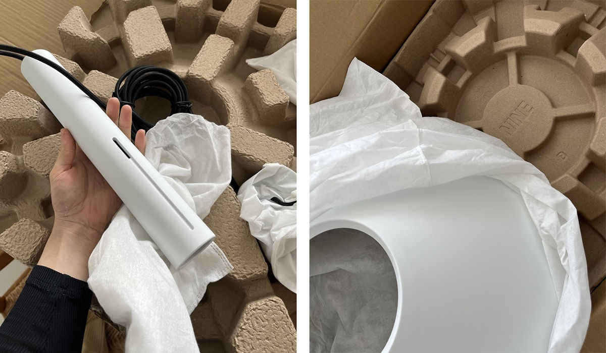
Hook pendant packaging © Alexandra Gerber
TB The sleek design is composed of minimal components, of which the namesake hook is pivotal to the pendant's function, was the hook the key starting point for the design?
AG No, really not - It's really the finishing point. I mean, there was always a hook but it developed into the one element that bound everything together. So, no, it was not a starting point, but it was definitely the finishing point.
TB Are there any plans or thoughts to develop Hook into a family of lighting with table or floor options, or is it envisaged as a solution most suited to pendant lighting?
AG Well, we've already started to work on a table light and subsequently also looked into a floor light. But with both, you suddenly have the opposite thing happening, the weight is no longer acting as a weight anymore when you have it on the floor on a table, which inverses how the hook would attach. So that then becomes the main question - is it a big deal if it's a different hook?
JT I can imagine it a bit like a sort of an S-shaped hook that would go in and work the other way, which would be really nice.
AG You'd think that - that was the first design, but actually, I didn't love it, I found the shape strange. I've worked on lots of different ideas and decided that the most important thing is to keep the simplicity of the three components, and the fact that there is this notion of floating between the parts. With that in mind, I think it's okay for each version to have a different hook. It's almost stronger because then it really gives an identity to each light. I don't know what NINE thinks about this, we haven't been through it fully yet. For me it's about keeping the simplicity and this almost floatiness about it, even though in the case of the pendant is the strongest element.

Hoot pendant mock-ups © Alexandra Gerber
AG I think it's more interesting to make the hooks different, they have to function so just let’s do it differently.
JT Yeah, the hook is the one piece of the design that's the key, which is really nice.
SS We probably shouldn't develop the whole product on this interview.
AG Shall we develop it now?! At least it’s recorded!
-
-
SS If you could own a piece produced by Nine but not designed by you, which would it be? I think present company excluded, we should veto anything by Butterfield Brothers, anything by John Tree and anything by Ali. Is there anything left?!
TB The Landmark Table by Dan Schofield.
AG + JT Yes, I’d take that!
Landmark Side Table by Daniel Schofield © Nicola Tree
TB The big ceramic tables are pretty amazing, construction-wise.
AG Yeah, mostly because I was quite impressed by it in terms of oh wow, he managed to do that on an industrial level.
SS Semi-industrial!
AG Yeah, but I mean, I thought oh wow, this was quite a courageous project. I would have said that for the unusualness of it, of the material.
JT Well, I like Keiji’s lights, it’s a really simple form but again clean and elegant, and in different colours to the colours that you and I have used, but then again each designer has their own colour palette but they all seem to work together, which adds a richness to it.
Lacquer Pendant by Keiji Takeuchi © Nicola Tree
TB Are there planned range extensions or new products you're working on for the future with NINE that you can share?
SS Range extensions - we’ve already discussed Hook, and John has proposed some very nice extensions for Skinny – this is all live, new information. And for 19 Outdoors, we already have - what, 13 pieces? So no, we need to find a way to reduce that! We would love to work with all these designers again; we have quite a lot already in development for next year. In some ways, what we launched this year was what we had ready. Some more complex projects are ongoing, but I won't say too much.
SS How did you begin working with Nine?AG For me, it was quite easy because I knew Sam and Tim (Rundle who worked with NINE on initial Art Direction) quite well from working at Tom Dixon. So, it was a fairly nice, easy process.TB I think something quite nice for me and Lennart Ebert, another NINE designer, was that Katie (Katherine Hoeger) was keen to include young, up-and-coming designers in the project. It's not necessarily people already on a roster of designers around Europe. Lennart’s project was one that she saw at Salone Satellite in Milan. And for Will and I, it was an opportunity to give young designers a bit of a platform.JT It's really important. The best brands have that balance, a whole range of different designers, rather than just going for the big names.
Bolt by Lennart Ebert © George Kroustallis
JT How did they communicate their aesthetic and ethos?
AG Tim had worked together with Katie and her team at Nine United to put together the aesthetic direction and design principles of NINE.
JT It was a small document, but it was really clear. There were honest materials, honest construction and use of strong colours. It wasn't so much decorative. It was very simple, but so simple and broad that it allowed different people to react in different ways; it wasn't very prescriptive.
AG No, it wasn't. That's true.SS It's really interesting what we've got back from that process of giving the look and feel in advance of having a brand. We have products that sit well together, and all follow the aesthetic. It was only quite a long way down the process of developing these projects that the designers started to see the other products and see how the brand looked as a whole. Being at 3DaysofDesign was the first time we presented a brand.
JT Our projects were interesting because it was a little bit like we were setting the tone, in a way. And it shows a lot of trust in designers to give such a loose, gentle brief as well. That looseness has allowed quite a strong design-led brand to emerge; every designer found their own voice within that structure that was put together.

Skinny Chair in blue stained ash © Nicola Tree
JT And it's paid off. There aren't many models of a brand going from zero to being in a space in Copenhagen in that short time. For such a quick evolution, it's impressive how succinct and together it is. No one just starts a brand like that, but you've managed to do it, which is incredible.
-
 Our thanks and gratitude to Tom Butterfield, Alexandra Gerber, John Tree and Sam Stotesworthy for taking the time to answer our questions and to everyone at Nine – we can’t wait to see what the future holds.If you’re unable to make it to our Islington shop, you can explore Nine’s collection in full here.


